Android Default SpeechRecognizer vs. ML Kit GenAI Speech Recognition: A Practical Field Guide
Voice input has quietly become table stakes for modern mobile applications. With Google’s rollout of the ML Kit GenAI Speech Recognition API, Android developers now have a modern alternative to the platform SpeechRecognizer — but only one of its two modes actually runs an LLM. This field guide covers what changes, what doesn’t, and what we learned shipping both to production.
Written by Sahil Chauhan
By Sahil Chauhan · Android Engineer at Pixster Studio
Published: August 25, 2026 · Read Time: ~7 min
📌 Key Takeaways
The “GenAI” distinction: Only Advanced Mode runs Gemini Nano on-device via AICore. Basic Mode wraps the same class of traditional on-device acoustic model in a modern reactive Kotlin Flow architecture — same engine, better client.
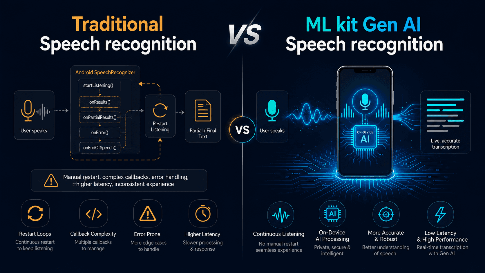
Why Basic Mode felt faster and more accurate: not a smarter model, but a smarter session. Traditional
SpeechRecognizertears down and relaunches on every conversational pause; ML Kit keeps one continuous streaming session open, removing the dropped-word restart penalty.Future-proofing:
preferredMode = MODE_ADVANCEDis safe to set today — the SDK transparently falls back to Basic wherever Advanced isn’t supported (currently Pixel 10, with more devices planned).
Voice input has quietly become table stakes for modern mobile applications — from interactive voice composers and assistive tools to search inputs and live dictation.
For years, the standard first-party tool on Android has been android.speech.SpeechRecognizer, an API rooted in Android 2.2 that predates Kotlin Coroutines, reactive Flows, and modern on-device neural runtimes.
With Google’s rollout of the ML Kit GenAI Speech Recognition API (com.google.mlkit:genai-speech-recognition), Android developers now have a modern alternative built on top of AICore, with an optional path to Gemini Nano.
The “GenAI” naming can cause real architectural confusion, though — only one of the API’s two modes actually runs an LLM. This field guide covers what changes, what doesn’t, how the two modes work under the hood, and what we learned integrating both into a few of our production Android apps.
1. Primary Mobile Use Cases
On-device speech recognition is typically used for real-time mobile interactions where network roundtrips cause friction:
Voice Input: Allowing users to dictate messages, notes, and search queries seamlessly instead of typing.
Live Transcription: Transcribing meetings, audio memos, or interviews locally with lower latency and stronger data privacy than cloud round-trips.
Hands-Free Voice Commands: Triggering interactive in-app actions and accessibility flows that react to spoken prompts.
2. The Legacy Friction Points with SpeechRecognizer
The platform android.speech.SpeechRecognizer has shipped on Android since API level 8, but building responsive, continuous transcription on top of it reveals several friction points:
Callback Complexity: Implementing
RecognitionListenerrequires juggling multiple asynchronous callbacks (onReadyForSpeech,onEndOfSpeech,onError,onResults, and others). Wrapping this in a coroutine callbackFlow is standard, but handling cancellation races arounddestroy()is a recurring source of production bugs.Fragile Pause Handling: Standard platform recognizers treat natural conversational pauses as session endpoints (
ERROR_SPEECH_TIMEOUTorERROR_NO_MATCH). Keeping continuous dictation alive requires manual restart loops that collide with Android’s audio focus subsystem — and each restart risks clipping the first word or two.Cloud dependency for best quality: By default,
SpeechRecognizercan route audio to Google’s servers, usually the most accurate option but costing you offline support. Forcing on-device viacreateOnDeviceSpeechRecognizer()gives a narrower, lower-quality model not guaranteed present on every device.
3. Deconstructing ML Kit GenAI: Basic vs. Advanced Mode
The ML Kit GenAI Speech SDK ships with a single unified interface, but operates across two distinct tiers:
Basic Mode: Modern Session Architecture on Standard Hardware
Google’s own documentation is explicit here: Basic mode uses the same class of on-device recognition model as the traditional SpeechRecognizer API — “the traditional on-device speech recognition model, similar to the SpeechRecognizer API.” On paper, that means comparable raw model accuracy, not a smarter engine underneath.
What the documentation says vs. what we observed in production
Based on several months of active development and multiple rounds of QA across a few of our Android apps, our team consistently observed better real-world transcription quality using ML Kit Basic mode over the traditional API — across devices spanning the large majority of our supported install base (API 31+ covers most active Android devices today).
We believe this gap comes down to architecture, not the underlying model. Traditional SpeechRecognizer treats every natural pause as a session boundary, forcing a teardown-and-relaunch cycle that risks dropping the first word or two after each restart. ML Kit Basic mode keeps a single continuous session open across pauses — streaming partial results the whole time — which removed that failure mode entirely in our testing. For an app where users pause naturally mid-sentence, that session-level improvement translated directly into a noticeably better product experience.
What Basic mode reliably gives you, per the documentation:
A modern Kotlin Flow client instead of
RecognitionListenercallbacks.Explicit, in-app model lifecycle management (
checkStatus(), thendownloadas a Flow you collect) instead of relying on implicit OEM behavior.Guaranteed on-device processing, with no silent cloud fallback.
Requirements: Android API level 31+.
Supported locales:
en-US, fr-FR, it-IT, de-DE, es-ES, hi-IN, ja-JP, pt-BR, tr-TR, pl-PL, cmn-Hans-CN, ko-KR, cmn-Hant-TW, ru-RU, vi-VN(several in beta).
Advanced Mode: Gemini Nano via AICore
Advanced mode is where the “GenAI” name is actually earned: recognition runs through Gemini Nano, on-device, via AICore, rather than a traditional acoustic model.
Per Google’s documentation, Advanced mode “produces broader language coverage and better overall quality” than Basic. Google doesn’t publish granular benchmark numbers (WER, latency), so treat “better quality” as a directional claim to verify against your own use case rather than a guaranteed uplift for every scenario.
Current availability: Advanced mode is documented as available on Pixel 10 devices, with more devices in development. Setting preferredMode = MODE_ADVANCED is safe to do today regardless: the SDK transparently falls back to Basic mode wherever Advanced isn’t supported, so you get forward-compatibility without a device-support branch in your own code.
Supported locales:
en-US, ko-KR, es-ES, fr-FR, de-DE, it-IT, pt-PT, cmn-Hans-CN, cmn-Hant-TW, ja-JP, th-TH, ru-RU, plus beta locales (nl-NL, da-DK, sv-SE, pl-PL, hi-IN, vi-VN, id-ID, ar-SA, tr-TR).
A related but separate product worth knowing about: Google also shipped Rambler, a Gemini-powered dictation feature built directly into the Gboard keyboard on Pixel 11 devices. Rambler edits natural, rambling speech into clean written text, strips filler words, and resolves self-corrections. It’s a consumer keyboard feature, not a public API, and isn’t the same product as ML Kit’s Advanced mode — related technology, different product.
4. Developer API Reference
Method | What It Does | Best Practice |
|---|---|---|
SpeechRecognition.getClient(options) | Factory that creates the recognizer client configured with your locale and preferredMode. | Scope as a singleton/manager to avoid reallocating native clients per session. |
speechRecognizer.checkStatus() | Checks model state: AVAILABLE, DOWNLOADABLE, DOWNLOADING, or UNAVAILABLE. | Call before opening the mic so you can prompt a download instead of hitting a runtime error. |
speechRecognizer.download | A Kotlin Flow you collect for download progress. | Drive an in-app progress indicator; it’s a Flow property, not a function. |
speechRecognizer.startRecognition(request) | Starts audio capture and returns a Flow of streaming recognition responses. | Collect on a background dispatcher; check the current SDK reference for exact response fields. |
speechRecognizer.stopRecognition() | Signals the engine to stop accepting new audio and finalize in-flight transcription. | Call when the user finishes speaking or taps Stop. |
speechRecognizer.close() | Releases native pipeline resources and AICore bindings. | Call in onCleared() of your ViewModel or when tearing down the feature. |
5. Implementation Pattern
6. Audio Pipeline Shifts: Real-Time PFD Streaming
For custom audio sources (VoIP streams, pre-recorded audio), AudioSource.fromPfd() imposes strict constraints:
Audio Format: Raw, headerless 16-bit mono PCM at 16 kHz (~32 KB/sec).
Real-Time Pacing Requirement: The file descriptor must be fed at real-time rate. Standard file-backed descriptors that read at full speed are explicitly not supported — feeding an entire buffer instantly will overflow the pipeline.
The pattern below is illustrative — pace your own implementation against your audio source’s actual timing rather than treating this as drop-in production code:
7. Field Gotchas & Production Lessons
Flushing in-flight partials on stop. When a user taps Stop, ML Kit may be holding an in-flight partial result that hasn’t settled into a final one. Destroying the client immediately can drop that last segment — keep a reference to the latest partial and commit it in your termination handler.
AICore cold-start errors. On freshly set-up or freshly reset devices, AICore may not have finished initializing:
601-BINDING_FAILURE: AICore service failed to bind — commonly seen right after device setup or app install; updating AICore and reinstalling the app typically resolves it.606-FEATURE_NOT_FOUND: AICore hasn’t finished downloading its latest configuration — usually resolves within minutes to hours on a network connection; a device restart can speed it up.Always gate your UI behind
checkStatus()so users never see these raw errors.
Unlocked bootloaders are hard-blocked. Google’s documentation states this plainly without giving a reason; don’t invent one in your own docs — just build a fallback path for it.
Alpha stability. The dependency is
1.0.0-alpha1— no SLA, breaking changes possible. Wrap the SDK behind your own interface so a breaking change doesn’t ripple through your app.
8. Decision Matrix
Feature / Metric | Legacy (Cloud) | Legacy (On-Device) | ML Kit (Basic) | ML Kit (Advanced) |
|---|---|---|---|---|
Model Engine | Server-side ASR | On-device acoustic model | Same class of on-device model | Gemini Nano via AICore |
Documented Quality Gain | Highest, mainstream languages | Baseline | None claimed — same model class | Broader coverage, better quality (Google’s claim) |
Session/Pause Handling | N/A | Restart-on-pause | Continuous streaming session | Continuous streaming session |
API Pattern | RecognitionListener callbacks | RecognitionListener callbacks | Kotlin Flow | Kotlin Flow |
Model Management | Implicit | System-driven | Explicit, in-app download Flow | Explicit, in-app download Flow |
Device Availability | Near-universal | API-dependent, OEM-variable | API 31+, most active devices | Pixel 10 today, expanding |
Release Status | Stable (GA) | Stable (GA) | Alpha (1.0.0-alpha1) | Alpha (1.0.0-alpha1) |
Summary & Key Takeaways
Basic mode’s real win is session architecture, not model accuracy. Google documents it as the same recognition engine as the traditional API — but in our own months of QA, eliminating the pause-triggered restart cycle measurably improved both perceived accuracy and user experience.
Advanced mode is the actual GenAI upgrade, currently gated to Pixel 10 with more devices planned. Setting
preferredMode = MODE_ADVANCEDtoday is safe and future-proof, since the SDK falls back to Basic automatically everywhere else.Adopt progressively. You don’t have to choose between broad device support and next-gen quality — ML Kit’s built-in fallback gives you both behind one API.
Sahil Chauhan is an Android Engineer at Pixster Studio, where our mobile engineering team builds and ships apps used by millions of users.